color_palette <- list(
    blue = c("#2973A5", "#648EB4", "#8BAAC7", "#B1C7D9", "#D8E3EC"),
    darkblue = c("#164C71", "#51708A", "#7C94A8", "#A8B7C5", "#D3DBE2"),
    yellow = c("#FDBE19", "#F6CC6C", "#F8D991", "#FBE5B5", "#FDF2DA"),
    skyblue = c("#309EBD", "#74B0C7", "#97C4D5", "#B9D7E3", "#DDECF1"),
    turq = c("#3C989E", "#77ACB0", "#99C0C4", "#BBD5D7", "#DDEAEC"),
    grey = c("#565C65", "#797D83", "#9A9DA3", "#BBBEC1", "#DDDEE0"),
    brown = c("#CC7D15", "#CD995B", "#DAB384", "#E7CCAD", "#F3E6D6")
)ggplot Templates
Keywords
productivity, modularization
Purpose
In this session, we will review how to use ggplot themes and review a few templates that could be useful for future data visualization.
Colors
We have a set of pre-selected Connect colors, listed below.
Using Rebecca’s code, we can pull the number of distinct colors we need:
select_colors <- function(number) {
  # Initialize a vector to store selected colors
  selected_colors <- character(number) # Assuming colors are character strings

  # Get the number of color groups and the maximum number of shades
  num_groups <- length(color_palette)
  max_shades <- max(sapply(color_palette, length))

  # Loop through each shade level and then each color group to fill the selected_colors
  counter <- 1
  for (shade in 1:max_shades) {
    for (group in 1:num_groups) {
      current_palette <- color_palette[[group]]
      if (length(current_palette) >= shade && counter <= number) {
        selected_colors[counter] <- current_palette[shade]
        counter <- counter + 1
      }
      if (counter > number) break  # Stop if we've reached the desired number
    }
    if (counter > number) break
  }

  return(selected_colors)
}
ggplot
Simple ggplot Example
Pull in relevant library
library(ggplot2)Create the data frame
x = c(10, 10, 20, 20, 30, 30, 40, 40, 50, 50, 60, 60)
y = c(5, 2, 3, 4, 1, 6, 4, 7, 2, 3, 5, 5)
z = c("girl", "boy", "girl", "boy", "girl", "boy", "girl", "boy", "girl", "boy", "girl", "boy")
data = data.frame(x, y)
Create our first line graph
ggplot(data, aes(x = x, y = y)) +
  geom_point(aes(color = z))+
  geom_line(aes(color = z))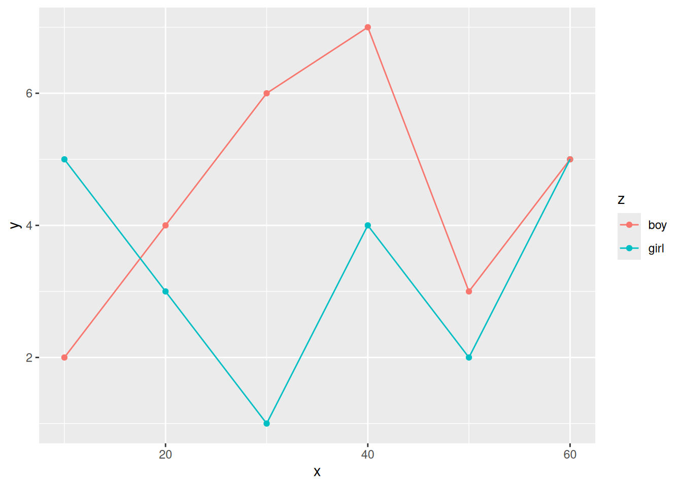
This graph is great but doesn’t align with our aesthetic.
ggplot(data, aes(x = x, y = y)) +
  geom_point(aes(color = z)) +
  geom_line(aes(color = z))+
  labs(title = "Title",
       x = "x",
       y = "y",
       legend = "Z") +
  scale_colour_manual(values = select_colors(2))+
  theme(plot.title = element_text(hjust = 0.5),
        panel.background = element_rect(fill = "white"),
        panel.grid.major = element_line(color = "grey"),
        panel.grid.minor = element_line(color = "grey"))
Ignoring unknown labels:
• legend : "Z"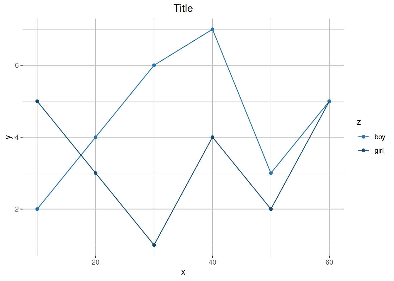
Looks much better, but we want to wrap it into a function.
Creating & Using Function
Below is a function that you can add to a plot after specifying titles & the number of categories (colors) you need for your graph.
theme_function = function(title, xlab, ylab, legend_lab, n) {
  # Add any theme specifications in here
  theme <- theme(
    plot.title = element_text(hjust = 0.5),
    panel.background = element_rect(fill = "white"),
    panel.grid.major = element_line(color = "lightgrey"),
    panel.grid.minor = element_line(color = "lightgrey")
  )

  # Defining the colors we will return
  color_scale <- scale_color_manual(values = select_colors(n))
  color_scale2 <- scale_fill_manual(values = select_colors(n))

  # Return a list containing the elements we want standardized
  list(
    # Change labels, or add new ones
    labs(
      title = title,
      x = xlab,
      y = ylab,
      color = legend_lab),
    theme,
    color_scale,
    color_scale2
  )
}ggplot(data, aes(x = x, y = y)) +
geom_point(aes(color = z)) +
geom_line(aes(color = z)) +
theme_function("Title", "X", "Y", "Gender", 2)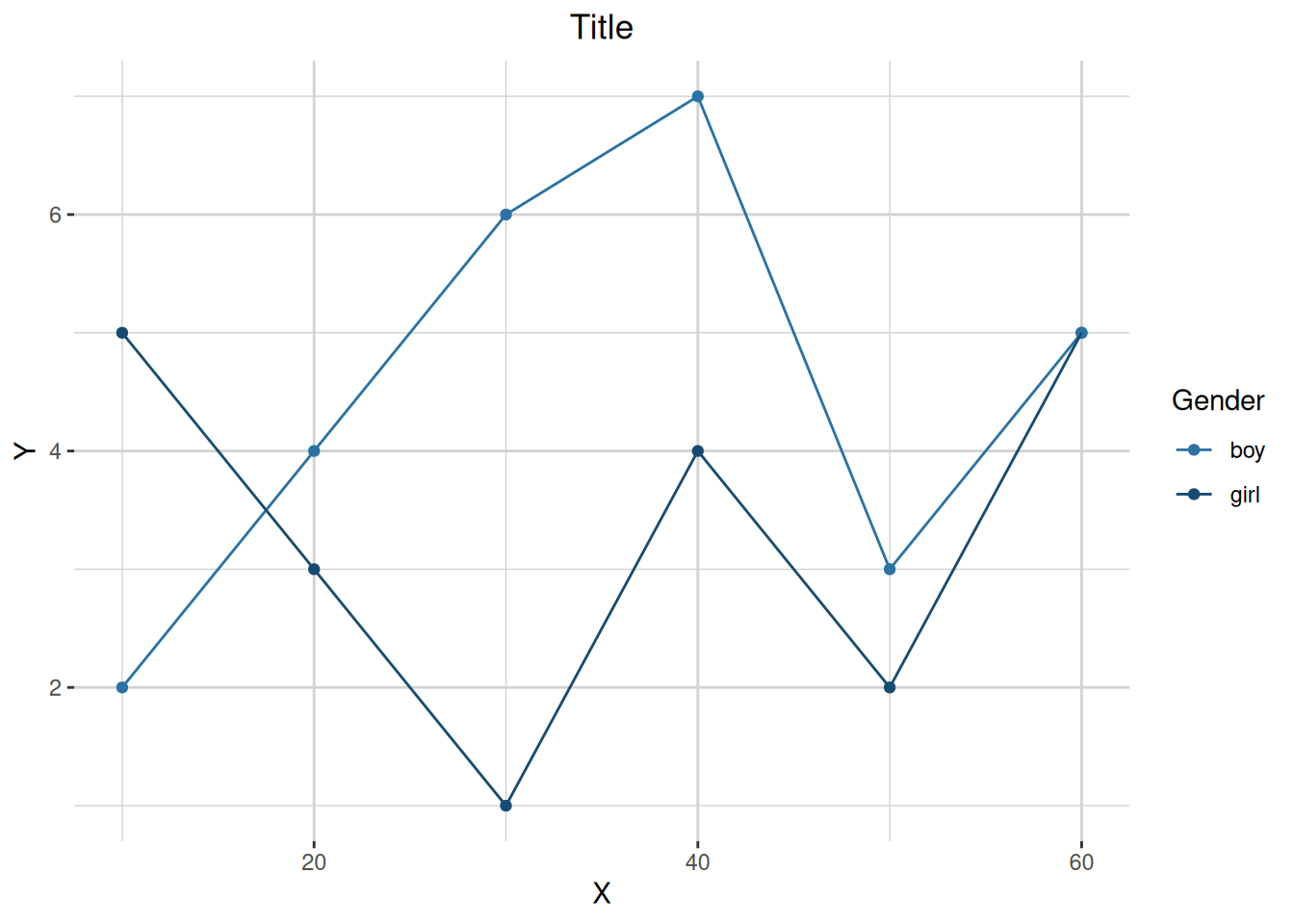
Histogram
library(palmerpenguins)
Attaching package: 'palmerpenguins'The following objects are masked from 'package:datasets':
penguins, penguins_rawcolnames(penguins)[1] "species" "island" "bill_length_mm"
[4] "bill_depth_mm" "flipper_length_mm" "body_mass_g"
[7] "sex" "year" ggplot(penguins)+
geom_histogram(aes(x= bill_length_mm, color = sex, fill = sex), binwidth = 1)+
theme_function("Title", "X", "Y", "Gender", 3)Warning: Removed 2 rows containing non-finite outside the scale range
(`stat_bin()`).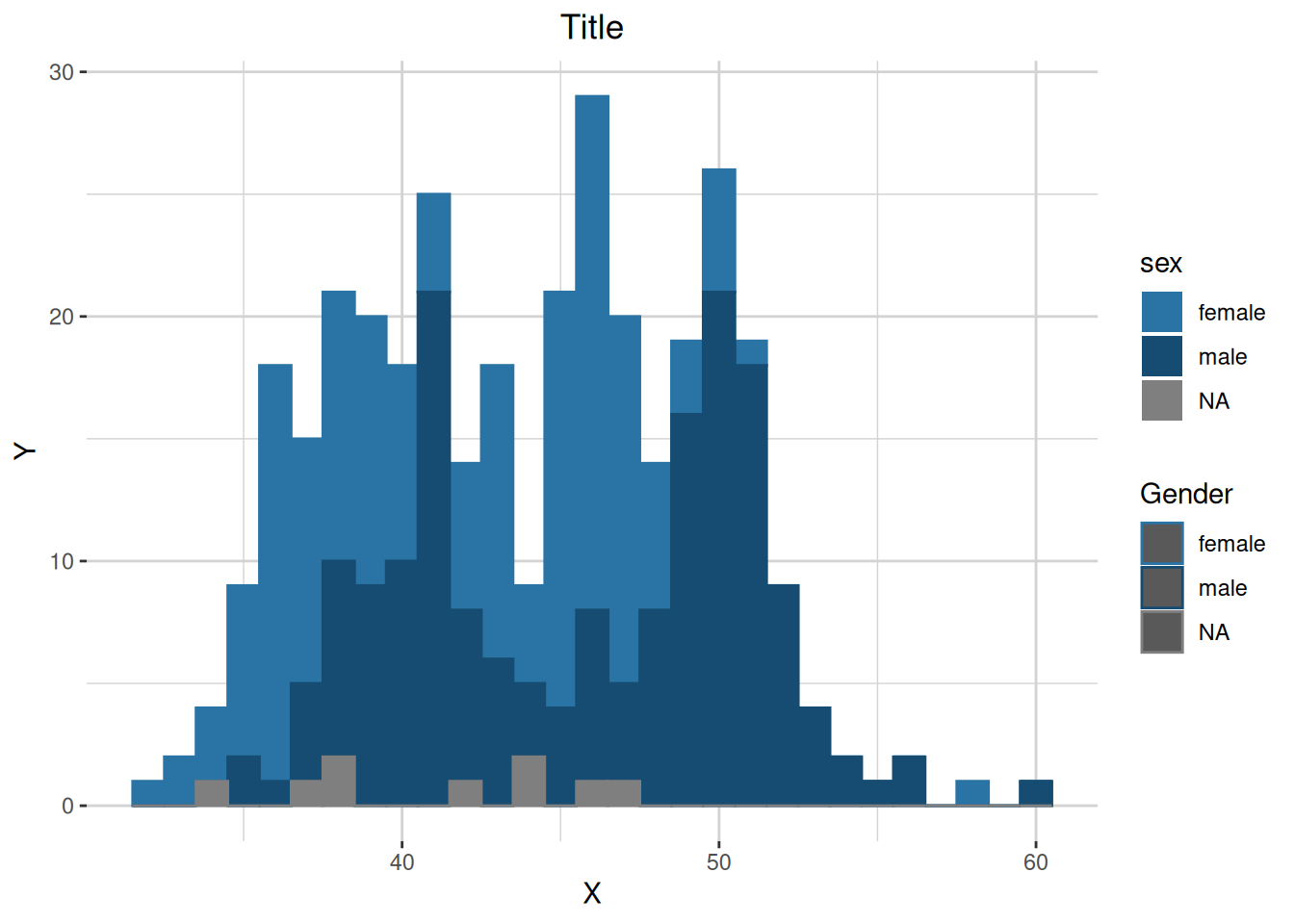
Bar Graph
ggplot(penguins)+
  geom_bar(aes(x= island, color = sex, fill = sex))+
  theme_function("Title", "X", "Y", "Gender", 3)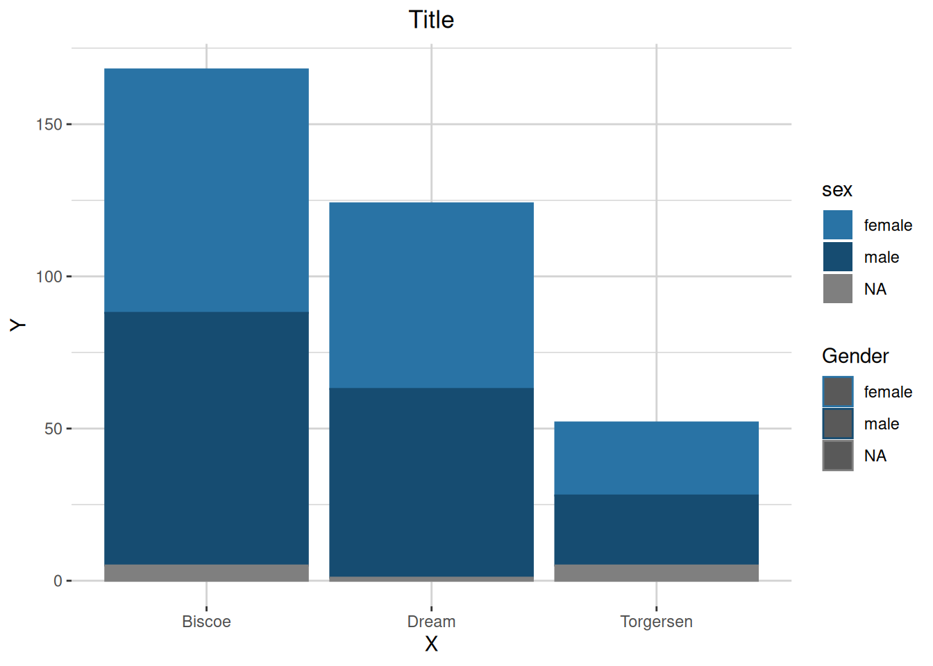
plotly
library(plotly)
Attaching package: 'plotly'The following object is masked from 'package:ggplot2':
last_plotThe following object is masked from 'package:stats':
filterThe following object is masked from 'package:graphics':
layoutSimple plotly Example
Create our first line graph
plot_ly(data,
        x = x,
        y = y,
        split = ~z,
        type = "scatter",
mode = "line & markers")plot_ly(data,
x = x,
y = y,
color = ~z,
type = "scatter",
mode = "line & markers",
colors = select_colors(2)) %>%
layout(
title = 'Title',
xaxis = list(title = "x"),
yaxis = list(title = "y"),
legend = list(title = list(text = "Gender"))
)Creating and using function
theme_plotly = function(plot, title, xlab, ylab, legend_lab) {
  plot <- plot %>%
    layout(
      title = title,
      xaxis = list(title = xlab),  # Use the xlab parameter
      yaxis = list(title = ylab),   # Use the ylab parameter
      legend = list(title = list(text = legend_lab))  # Use the legend_lab parameter
    )

plot  # Return the modified plot
}
plot = plot_ly(data,
x = x,
y = y,
color = ~z,
type = "scatter",
mode = "line & markers",
colors = select_colors(2))
theme_plotly(plot, "Title", "X", "Y", "Legend")